Knowledge, skills, and software introduced throughout the module are to be synthesised and applied in the development of a type-based project that addresses a specific issue or area of interest within design, animation, entertainment, or a related field.
One of the following directions is to be chosen:
A Purpose-Driven Typeface
A new font (.ttf) is to be designed with the aim of solving a real-world problem or contributing meaningfully to a chosen field.
Modification of Existing Letterforms
An existing typeface is to be analysed, its limitations identified, and improvements or valuable combinations proposed and developed.
Typographic Experimentation
An original typographic experiment is to be proposed and executed. Unconventional materials or media, such as 3D forms, motion, sound, or fine art may be explored. The form of the final output is to be defined by the student.
Final Outcome: A generated font (.ttf) with relevant applications, or an experimental typographic piece presented in a format appropriate to the concept (e.g., print, video, installation, or other media).
PROCESS WORK
Task 3 / Type Exploration and Application
Identifying Issue
LLM Lettering
LLM lettering is a set of sans-serif typeface developed by the Malaysian Highway Authority (Lembaga Lebuhraya Malaysia, LLM) for use on national highway signages. It consists of two styles: LLM Normal and LLM Narrow. While it has long served as the standard across Malaysia’s highways, a closer analysis reveals opportunities for improvement in its design, particularly in terms of legibility at high speeds and long viewing distances. I will be focusing specifically on LLM Normal, while LLM Narrow is examined in detail by Daphne Lai on her blog: Check out her research here!
To study this further, I began observing highway signages along my daily commute to Taylor’s University, focusing especially on the LDP Highway. Most of the signs along this route utilise LLM lettering, including both LLM Narrow and LLM Normal. I also began to assess their legibility in real-world conditions, which I will discuss in more detail below.
Figure 1.2 Malaysia highway road signages. Photo taken by Wing Chang.
A digital deconstruction of LLM Normal reveals that the typeface does feature some optical corrections intended to improve legibility. For example, the lowercase 'd' features a bowl that subtly tapers as it meets the vertical stem. Without this tapering, the junction between the bowl and the stem could appear overly dark or bulky, which could disrupt the balance of the text, especially when rendered at small sizes.
Similarly, the uppercase S displays a slightly smaller upper counter, a common typographic refinement used to balance the perceived weight between the upper and lower storey of the letterform. Without this correction, the top storey of the S would visually overpower the bottom, making the character appear top-heavy and throwing off the overall uniformity of the typeface in a block of text.
Figure 1.3 Optical corrections of LLM Normal (22/06/2025)
However, most of the uppercase and lowercase characters of LLM Normal share nearly identical stroke widths (Figure 1.4). In well-optimized typefaces, lowercase strokes are often made slightly thinner to account for optical differences and to maintain harmony between uppercases and lowercases.
Figure 1.4 Stroke width of uppercase and lowercase of LLM Normal (22/06/2025)
This lack of differentiation in stroke weight between lowercases and uppercases results in inconsistent visual weight of strokes across cases. To illustrate this, Wayfinding Sans ExN Bold (a typeface from the Wayfinding Sans Pro family, purpose-built for road signage) was used for comparison. As seen in Figure 1.5, the lowercase 'h' and 'o' in LLM Normal appear heavier and even slightly larger than their uppercase counterparts.
Figure 1.5 Comparison of weight consistency between uppercase and lowercase characters in Wayfinding Sans ExN Bold (left) and LLM Normal (right) (22/06/2025)
As a result, the lowercase characters in LLM Normal are forced to compromise with smaller counterforms. This is because maintaining the same stroke width across both uppercase and lowercase letters, despite the smaller scale of the lowercase letters, reduces the space available for the counters, leading to tighter and more compressed forms.
Figure 1.6 compares Wayfinding Sans ExN Bold and LLM Normal at a reduced scale, with added blur to simulate how they might appear when viewed from a distance. Wayfinding Sans ExN Bold preserves open, well-proportioned counterforms that remain distinguishable even under such conditions. In contrast, while the stroke weight consistency of LLM Normal seemed acceptable, the lowercase 'e' particularly, features a small closed counter and a tight aperture that collapses when blurred, making it look similar to lowercase 'o' and potentially leading to misreading at high speeds.
Figure 1.6 Simulated legibility comparison between characters in
Wayfinding Sans ExN Bold (left) and LLM Normal (right) at distance (22/06/2025)
For instance,Clearview, a U.S. highway typeface granted Interim Approval (IA-5) by the FHWA in 2004 and reinstated in 2018, features larger and more open counterforms than the originally used typeface, Highway Gothic, improving legibility at a distance under glare, motion blur, or low lighting (Figure 1.7).
Figure 1.7 Clearview has larger counter forms compared to Highway Gothic
Figure 1.8 shows the difference in corner treatments between Wayfinding Sans ExN Bold and LLM Normal. Wayfinding Sans ExN Bold employs rounded corners, whereas LLM Normal features sharp corners. While these distinctions may appear minor at full scale, their impact becomes more apparent when viewed from a distance or under motion blur.
Figure 1.8 Shapes of corners of
Wayfinding Sans ExN Bold (left) and LLM Normal (right) (22/06/2025)
As seen in Figure 1.9, this difference directly affects halation (refer to figure 1.10), the visual blooming or glow that occurs around white text on dark backgrounds, especially under high-intensity lighting conditions such as headlights or sunlight. Rounded corners in Wayfinding Sans ExN Bold help to soften the transitions between strokes and the surrounding space, reducing halation around the letterforms and preserves legibility. In contrast, the sharp corners of LLM Normal create harsher edge contrast, which tends to amplify halation, leading to increased optical noise and reduced readability at high speeds or long distances.
Figure 1.9 Halation
Wayfinding Sans ExN Bold (left) and LLM Normal (right) at distance (22/06/2025)
Figure 1.10 Halation effect illustrated in Highway Gothic
I referred to the official KPP test resources to identify the different road sign colour combinations used in Malaysia, in order to determine whether adjustments in letterspacing or weight are needed for optimal legibility, such as white type on green or black type on white backgrounds.
*However, the visualisations later on will be conducted using approximate colours on digital devices, as the official specifications are defined using chromaticity coordinates rather than digital hex codes. These chromaticity values are based on physical reflectivity and material standards (such as retro-reflective films), which cannot be accurately reproduced on standard RGB screens.
Under the suggestion of Mr. Vinod, I studied Wayfinding Sans Pro, a typeface specifically engineered for legibility in road signage to better understand how its form was constructed with scientific consideration to enhance clarity. The typeface designed by Ralf Herrmann, has been empirically tested to perform under difficult reading conditions on the road.
*Limitation: Publicly available documentation of Wayfinding Sans Pro does not specify the exact colour values used during testing, which may not align with the official road sign colours used in Malaysia.
Figure 4.1 Wayfinding Sans Pro designed by Ralf Herrmann.
Wayfinding Sans Pro offers both positive and negative contrast versions to balance the optical effect where light text on dark backgrounds appears bolder. These variants are only necessary when both contrast types appear on the same sign. Otherwise, the negative contrast version is used by default. As the only available free trial for testing purposes from the Wayfinding Sans Pro family, Wayfinding Sans ExN Bold (negative contrast) was chosen to be dissected for analysis later on.
In addition, Clearview, a U.S. highway typeface granted Interim Approval (IA-5) by the Federal Highway Administration (FHWA) in 2004 and reinstated in 2018, was also examined for comparison.
Through the uppercase comparison in Figure 4.4, LLM Normal features a generally thicker stroke, which increases visibility at close range. However, at a distance, this weight difference becomes less noticeable, counterforms start to play a more crucial role in legibility (Figure 4.5).
ClearviewHwy-3-B has the narrowest uppercase among the three, allowing more characters to fit within limited space. It also features larger counterforms than LLM Normal, which aids legibility from afar. Wayfinding Sans ExN Bold, on the other hand, offers the widest and most open counterforms, giving it the clearest presence at a distance (Figure 4.5).
Figure 4.4 Comparison of uppercase letterform between ClearviewHwy-3-B,
LLM Normal and Wayfinding Sans ExN Bold (24/06/2025)
Figure 4.5 Comparison of uppercase letterform between ClearviewHwy-3-B,
LLM Normal and Wayfinding Sans ExN Bold at distance (24/06/2025)
The slanted terminals on the ascenders and descenders of lowercase letters in both LLM Normal and Wayfinding Sans ExN Bold help facilitate quicker character differentiation under high-speed reading conditions (Figure 4.6).
Figure 4.6 Slanted terminals of LLM Normal and Wayfinding Sans ExN Bold (24/07/2025)
Through observation, the height of the middle bars in Wayfinding Sans ExN Bold varies across letters such as B, E, F, and H. This deliberate inconsistency is likely intended to ensure each letter maintains clear distinction, especially at a distance or small scale. Same applies to letter H, P, R, B and D (Figure 4.8). Top Arm of letter E and F has different width.
Figure 4.7 Comparison of Middle Bar Heights in Letters B, E, F and H
of Wayfinding Sans ExN Bold (24/06/2025)
Figure 4.8 Comparison of middle bar heights and stem weights in letters H, P, R, B and D of Wayfinding Sans ExN Bold (Same colour = Same weight) (25/06/2025)
The curvature of letter C and G appears to be deliberately adjusted, possibly to avoid confusion with O, especially when viewed from a distance or under poor visibility. O and Q seem to share an identical bowl shape to maintain consistency, with the tail in letter Q be the distinguishing feature (Figure 4.9).
Figure 4.9 Overlapping outlines of uppercase letters O, C, G and Q
of Wayfinding Sans ExN Bold (27/06/2025)
I trimmed the right half of Wayfinding Sans Pro's letter O, then duplicated and mirrored it to form the left side (Figure 4.10). After uniting both halves and overlaying the result onto the original O, I observed that the letter is not perfectly symmetrical, the upper left stroke of the reflected version appeared slightly thicker than the original, suggesting that the original O has likely been subtly adjusted to compensate for optical illusion (perfectly symmetrical letterforms can appear distorted to the human eye).
Figure 4.10 Symmetry test of letter O of Wayfinding Sans ExN Bold (27/06/2025)
The same dissection method was applied to the uppercase 'D', which revealed a vertically symmetrical construction between its upper and lower parts (Figure 4.11).
Figure 4.11 Letter D's symmetrical upper and lower part
of Wayfinding Sans ExN Bold (25/06/2025)
The curvature of the letter D closely resembles the right-hand arc of the letter O, suggesting that its bowl may have been derived from O's structure to maintain consistency within the typeface (Figure 4.12).
Figure 4.12 Overlapping outlines of uppercase letters O and D of Wayfinding Sans ExN Bold (27/06/2025)
The upper storey of the letter S in Wayfinding Sans ExN Bold is slightly narrower than the lower storey. The curvature at the top and bottom closely resembles that of the letter C (Figure 4.13).
Figure 4.13 Letter S dissection of Wayfinding Sans ExN Bold(28/06/2025)
In the letter V, the left diagonal stroke is slightly thicker than the right (Figure 4.14).
Figure 4.14 Letter V dissection of Wayfinding Sans ExN Bold(01/07/2025)
Through dissection, the asterisk in ClearviewHwy-3-B appears to be constructed from a decagonal base structure (Figure 4.15).
The initial version of the redesigned uppercase B (Figure 5.1) appeared visually similar to the number 8 when viewed at smaller sizes.
Figure 5.1 Redesigned letter 'B' Version 1 (Right),
Blurred redesigned letter 'B' Version 1 (Left) (24/06/2025)
Improvement from previous version: The upper bowl was reduced in size, both the outer corner radius and bowl curvature were decreased to minimise overall roundness and enhance distinction from the number 8, especially at smaller scales (Figure 5.2).
Figure 5.2 Redesigned letter 'B' Newest Version (Left),
Blurred redesigned letter 'B' Newest Version (Right)(24/06/2025)
Unlike the wider uppercase form in Wayfinding Sans ExN Bold, I chose to align the width of uppercase H with that of uppercase B to maintain consistency and improve space efficiency, resulting in a narrower uppercase H (Figure 5.3).
Figure 5.3 Width of redesigned letter 'H' same with width of redesigned letter 'B' (24/06/2025)
Issue of version 1: Gap between the stem and leg is too narrow, resulting in an insufficient counterform that makes the upper portion appear visually heavier. Lower counterform too small, resulting reduced legibility at smaller sizes / from a distance (Figure 5.4). Also increases the risk of the letter being misread as a uppercase K, especially under poor visibility conditions.
Figure 5.4 Redesigned letter 'R' Version 1 (Left),
Blurred redesigned letter 'R' Version 1 (Right) (25/06/2025)
Figure 5.5 shows the newest redesigned uppercase R, both the upper and lower counterforms are now better balanced and reduced form similarity to the uppercase K.
Figure 5.5 Redesigned letter 'R' Newest Version (Left),
Blurred redesigned letter 'R' Newest Version (Right) (25/06/2025)
Ink traps were incorporated into the letter X to enlarge its counterform and enhance legibility. For design consistency, the ink traps were shaped by overlapping the letter V onto X and trimming away the non-overlapping areas of X, following the contours of letter V's ink traps (Figure 5.6).
Figure 5.6 Construction of letter X(02/07/2025)
To maintain consistency across the redesigned typeface, the lowercase 'p' was constructed by overlapping the lowercase 'h' onto the lowercase 'n' (Figure 5.7). This ensured that the stem width and slanted descender terminal of 'p' stay visually aligned with the rest. Figure 5.8 shows the construction of lowercase 'p'.
Figure 5.7 Construction of lowercase p (Step 1) (06/07/2025)
Figure 5.8 Construction of lowercase p (Step 2) (06/07/2025)
The foundational structure of the redesigned letter 'a' was constructed by from the redesigned letters 'r', 'd' and 'l', drawing the vertical stem from 'l', the entry stroke and terminal shape from 'r', and the bowl structure from 'd' to ensure consistency in form and legibility within the type system (Figure 5.9).
Figure 5.9 Construction of lowercase 'a' (06/07/2025)
The redesigned lowercase 'c' is constructed by scaling down the uppercase C, overlapping it with the lowercase 'o', then trimming off the excessive parts (Figure 5.10). Further adjustments has been done for optical correction.
Figure 5.10 Construction of lowercase 'c' (06/07/2025)
Several key features has been incorporated into the new typeface to address limitations observed in LLM Normal: - The introduction of ink traps (Read about this at further reading section) - Enlarged counterforms
- Rounded exterior corners
- Slanted terminals on ascenders and descenders
I named the new typeface 'Milky Way' as a playful nod to its ink traps, which resemble the shape of nipples (milky), while 'way' references roads. Together, Milky Way lights Malaysia's road ahead with greater clarity, much like the stars it's named after.
Figure 5.11 Development of forms (16/07/2025)
Figure 5.12 Construction of uppercase (16/07/2025)
Figure 5.13 Construction of lowercase (16/07/2025)
Figure 5.14 Construction of numerals (16/07/2025)
Figure 5.15 Construction of punctuation marks (16/07/2025)
Determining Letter & Line Spacing
Once the construction of the new typeface was complete, I imported the glyphs into FontLab for further adjustments including correcting anchor points, fine-tuning spacing and kerning pairs (Figure 6.1).
Figure 6.1 Importing glyphs to Fontlab (16/07/2025)
Before beginning the letterspacing and kerning process, I studied the spacing characteristics of Wayfinding Sans Pro to understand how its letterforms were optically balanced for legibility (Figure 6.2). As road signage fonts typically feature looser spacing than conventional text fonts to preserve counterforms and prevent crowding at a distance, this served as a key reference in developing the spacing system for my own typeface.
Figure 6.2 Analysing Wayfinding Sans Pro letterspacing.
I began by determining the sidebearings of uppercase H, O, and I. Since O is typically perceived as visually wider due to its curved form, I set its sidebearings narrower than H to maintain consistent optical spacing. The sidebearing for H was set at 64 while O was set at 44. Following this, I applied a similar value of 60 to I to ensure it aligned visually with H and did not appear too isolated or tight when placed between other characters (Figure 6.3).
Figure 6.3 Determing side bearings of uppercase O, H and I (16/07/2025)
Figure 6.4 Lowercase kerning process (snippet) (16/07/2025)
Figure 6.5 Numbers kerning process (snippet) (17/07/2025)
Figure 6.6 Punctuation marks kerning process (snippet) (17/07/2025)
Figure 6.7 Deleting nodes in Font Lab (snippet) (18/07/2025)
Figure 6.8 Determining line gap (snippet) (18/07/2025)
Kerning pairs
Here's a list kerned pairs (but not all, just to show):
Diagonal + Straight Combos Often need negative kerning (they tuck in too close or leave too much space): - AV, VA - AW, WA - AT, TA - AY, YA - AK, KA - FA, AF
Round + Straight Combos Round letters create optical gaps next to straights: - To, Ta - Vo, Va - Yo, Ya - Pa, Po
Round + Round Combos Round letters beside each other often look too loose: * OO, OC, CO * GO, OG * CQ, QC
Narrow Combos Tall/narrow letters next to wide ones feel uneven: - LT, TL - FI, IF - LI, IL - TI, IT
Process (Font Presentation & Application)
To communicate the features of Milky Way and the design decisions behind it, a series of font presentation panels were developed (Figure 7.1). Presentation 01 (upper left) displays the complete glyph set created for Milky Way, offering an overview of its forms and consistency across letters. Presentation 02 (upper right) introduces the design rationale and motivations that guided the development of the typeface, explaining the choices made to enhance legibility and functionality. Presentation 04 (lower left) focuses on one of the typeface's defining characteristics -- the use of ink traps and illustrates how they contribute to clarity, especially at smaller sizes or under less ideal conditions. Finally, Presentation 05 (lower right) features a blur test table simulated in Photoshop (Figure 7.2) to evaluate the legibility of each character when viewed at a distance or in rapid motion, reaffirming the typeface's effectiveness for highway signage.
Figure 7.1 Final font presentation 01,02,04 & 05 (20/07/2025)
Figure 7.2 Applying Gaussian Blur in Adobe Photoshop (20/07/2025)
To best visualise how Milky Way would appear on actual expressway signage, I created vector illustrations (Figure 7.5) based on real Malaysian road signs (Figure 7.3).
Figure 7.3 Image of road signages in Malaysia (20/07/2025)
*Note: The colours used are approximate representations for digital purposes. Official specifications are defined using chromaticity coordinates, which correspond to physical materials (e.g., retro-reflective films) and cannot be precisely replicated on standard RGB screens.
Figure 7.4 Illustration process in Adobe illustrator (20/07/2025)
Figure 7.5 Final font presentation 03 (20/07/2025)
For font application, since ready-made highway signage mock-ups were hard to find online, I had to create them by myself. I illustrated more signages in Adobe Illustrator (Figure 7.6), then placed them onto stock highway images and edited further using Adobe Photoshop (Figure 7.7 to 7.8).
Figure 7.6 Illustration process in Adobe illustrator pt.2(20/07/2025)
Figure 7.7 Removing excessive background of stock image in Adobe Photoshop (20/07/2025)
I matched the colours of the illustrated signage to the tones of the original environment to create a more realistic and accurate simulation of how Milky Way would appear in real-world scenarios (Figure 7.8).
Figure 7.8 Match colour of illustrated signages to original stock image in Adobe Photoshop (20/07/2025)
The mock-ups shown in Figure 7.9 (left 1 & 2) were manually edited, while the mock-up on the right (Figure 7.9, right 1) was created using a PSD mock-up file from Mockup Design.
Figure 7.9 Final font applications (20/07/2025)
Process (HONOR Talents Global Design Awards 2025)
For HONOR's standby theme, I first tried using the original Milky Way typeface, but the draft ended up looking quite bland and didn't feel interesting visually (Figure 8.1).
Figure 8.1 First draft (19/07/2025)
After a few explorations, I decided to reinterpret my Milky Way font by turning the numerals 0 - 9 into winding, road-like forms (Figure 8.2). It felt like a natural direction since the typeface was originally built for highway signage and designed with legibility in mind.
Figure 8.2 Reinterpretation of the Milky Way font (19/07/2025)
That led me to think about aerial maps (Figure 8.3). I thought it'd be interesting to integrate the type as actual roads, which could push the concept further, linking the visuals back to how Milky Way was all about navigation, guidance and its intended use on the road.
Figure 8.3 References and inspirations (Pinterest) (19/07/2025)
Few quick sketches were produced (Figure 8.4), then proceed to illustrate them in Adobe Illustrator (Figure 8.5).
Figure 8.4 Sketches (19/07/2025)
Figure 8.5 Illustration process (snippet) (19/07/2025)
I chose a colour palette of black, white, green, red, and yellow for the designs to reflect the colours commonly used in Malaysian road signage and traffic lights, reinforcing the theme of navigation and wayfinding. For the lockscreen clock design in Figure 8.6, the caption "Breathe, then go." prompts viewers to take a brief pause before they set off for work, class or daily responsibilities, as a warm note of encouragement they see the moment they check their screen.
Figure 8.6 Final design (21/07/2025)
Figure 8.7 Final design (21/07/2025)
For the background design (Figure 8.8), speech bubbles like "I'm so lost :(" and "Jam! Almost there!" echo the everyday chaos of commuting, while signboards pointing to familiar places like Kuala Lumpur (the capital of Malaysia) reflect where I'm from and how I grew up. It also ties back to how Milky Way quite literally becomes part of Malaysia's highway language by turning the typeface into the roads themselves, embedding the font within the landscape it was designed for.
Figure 8.8 Final design (21/07/2025)
The design (Figure 3.8) resembles a network of intertwining roads when viewed from above, much like the complex layout of Malaysia’s urban highways (Figure 8.9).
Then, I started to animate the lockscreen clock design in Adobe After Effects (Figure 8.9).
Figure 8.10 Animation process in Adobe After Effects (21/07/2025)
The back-and-forth movement of the cars represents the rhythm of everyday life --how, even in its repetitiveness, we keep going. Paired with the caption "Breathe, then go," it serves as a gentle reminder to pause, reset, and carry on despite the daily rush.
Figure 8.11 Final Honor Clock Standby Design Animation MP4 (21/07/2025)
Figure 9.15 Final Honor Clock Standby Design (Background) PNG (21/07/2025)
Figure 9.16 Final Honor Clock Standby Design Animation MP4 (21/07/2025)
Figure 9.17 Final Honor Clock Standby Design Ellaboration PDF (21/07/2025)
Font Tester
Type here to test the font.
64px
120%
*Note: Due to HTML/JavaScript limitations, the opening quotation marks “ and ‘ may be rendered as their closing counterparts ” and ’ in this web font tester, even if the typeface includes distinct glyphs for each. If accurate visualisation is required, please copy and paste “ and ‘ directly into the container.
FEEDBACK
Task 3 / Type Exploration and Application
Week 10 (24/06/2025)
General feedback: -
Specific feedback: Study existing wayfinding font (Wayfinding Sans Pro), add ink traps, dissect existing wayfinding font and study
Week 11 (01/07/25)
General feedback: Study existing typefaces, make sure to construct on a 1000pt height artboard
Specific feedback: Two possible directions: Completely overhaul and redesign Malaysia's signage typeface by developing a new, original system / Develop refined variations based on the existing signage typeface, preserving its core visual form
Week 12 (08/07/25)
General feedback: Submission is on next week
Specific feedback: When viewed side by side, the thicker signage may appear clearer at close range, but from a distance, particularly on highways, the difference in font weight and clarity becomes negligible. In fact, the thinner type offers larger counterforms, which can enhance legibility. Ultimately, the decision should prioritise functional readability over perceived boldness
Week 13 (15/07/25)
General feedback: Finalise design and complete blogpost, to be checked by Mr. Vinod on week 14
Specific feedback: -
REFLECTION
Experience
Taking on the challenge of designing a typeface for Malaysian expressway signage was at times, frustrating, but incredibly rewarding. It pushed me to do a lot of research, not just at the start but throughout the entire proces, I had to keep learning and adapting. I studied established typefaces like Clearview, Lato, Helvetica, and Wayfinding Sans Pro, and by analysing them in detail, I started to notice all the optical corrections designers made, almost none of the letters are purely geometrical.
One of the hardest parts was figuring out the overall stroke weight and balancing it with the counterforms. When I tested the letters under blur conditions, I noticed how something like a “B” could easily be misread as an “8” when viewed from a distance or at a smaller scale. Things like subtle bowl curves that seem fine up-close can completely disappear when seen from far away. So decisions like these couldn't be rushed. Unlike the final task back in Typography module, where you might just kern a few letters, a highway typeface needs full kerning across uppercase, lowercase, numbers, and punctuation. Poor kerning just isn't acceptable on a road sign.
Through this process, I picked up so much, from the technical side like importing and exporting a font through a font editor like FontLab, to more design-specific things like handling counter spaces, curvature, corner radius, ink traps, and setting the x-height, ascender, and descender. I even had to dive a bit into how human vision works, simulate different viewing conditions in Photoshop and test how legible the typeface would be in less ideal situations.
Designing for clarity and functionality was a completely different experience from the more expressive, decorative font I created in the previous Typography module (Tide). Both taught me different things, but this one forced me to think about real world application and how typography could impact functionality and even safety, especially in high-stakes environments like road systems.
Observation
Throughout the process, I observed how even subtle changes in stroke or spacing could significantly affect legibility, especially when viewed under less ideal conditions. I noticed that letters which appeared clear and refined on screen often fell apart when blurred, distorted or shrunk. This made me more aware of how type is perceived in real-world scenarios, particularly in motion, under glare, or from a distance.
Findings
I came to realise that designing for function requires a fundamentally different mindset, one grounded in iteration, discipline, and empathy. It's not merely about visual appeal, but about maximising clarity and making intentional compromises to enhance readability. The challenge lay in finding a balance between preserving a typeface's character and personality without sacrificing legibility. I came to appreciate how important it is to test often, stay detail-oriented, and not assume that an elegant form is always a readable one.
FURTHER READING
1. JPJ 1: A Standardised Number Plate Typeface for Malaysia by Vinod Nair, 2023
Figure 10.1 JPJ 1: A Standardised Number Plate Typeface for Malaysia by Vinod Nair, 2023.
This is a blog written by Vinod J. Nair, detailing his journey to standardise Malaysia's vehicle number plate typeface. Frustrated by the inconsistent and unofficial fonts used across the country, he began designing alternatives in 2018 and eventually developed JPJ 1 (Figure 10.2), a refined and digitally available version of the widely used but unstandardised Factory Manufactured Typeface (FMT), by analysing the FMT's structure, the designer introduced improvements such as corrected proportions and ink traps for better legibility at distance.
Figure 10.2 JPJ 1 designed by Vinod J. Nair
Familiarity Bias
According to Nair, The FMT's widespread use has made it both familiar and highly legible to many Malaysians. He believes that familiarity and legibility are closely intertwined; the more often a typeface is seen, the more legible it appears to the viewer.
Grid
The designer deconstructed the FMT and discovered that all alphanumeric characters were derived from a 4 × 7 grid, which maintained consistent stroke thickness and width throughout. However, this led to compromises in characters such as N, W, and M, which are normally wider, resulting in slightly constrained and compressed forms (Figure 10.3).
Figure 10.3 Deconstruction of Factory Manufactured Typeface (FMT) using grid by Vinod J. Nair
Counterform
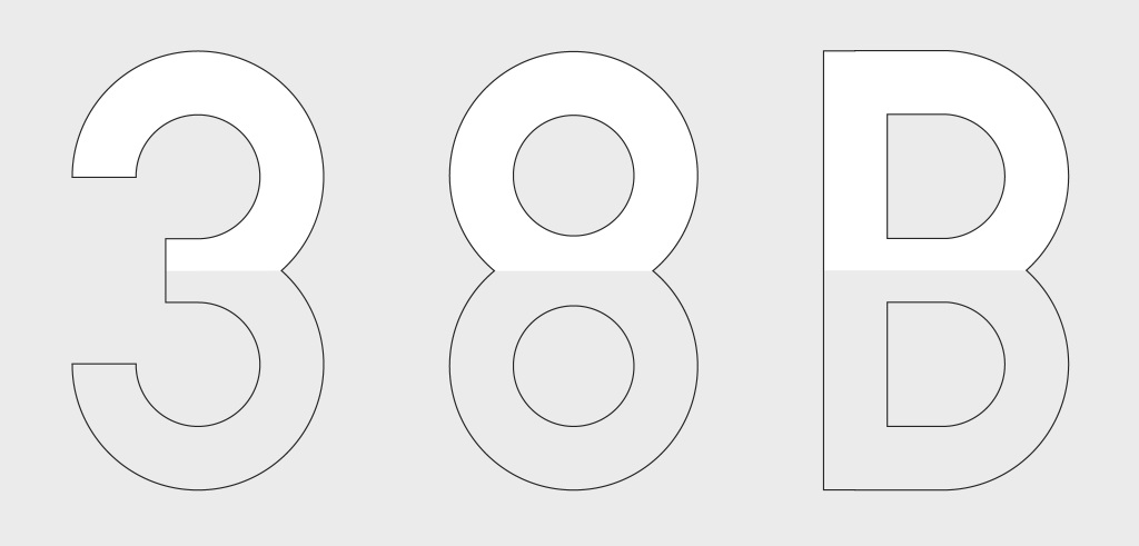
Nair also discovered that the counters in FMT's characters like 3, 8, and B are equal in size, which creates a top-heavy appearance (Figure 10.4). This visual imbalance stems from how the brain interprets forms.
Figure 10.4 Equal upper and lower story counters, by Vinod J. Nair
Nair addressed this by reducing the size of the upper-story counters of his JPJ 1 typeface to correct for the optical illusion and achieve a more balanced form (Figure 10.5).
Figure 10.5 Side by side comparison of alphanumeric 3, 8 and B
(FMT: left, and JPJ 1: right) by Vinod J. Nair
Ink Traps
To further enhance legibility, Nair introduced contrast and ink traps into JPJ 1 (Ink traps: originally developed by Matthew Carter for Bell Centennial to counteract ink spread on low-quality paper during high-speed printing). Applying ink traps to JPJ 1, they help to maintain the typeface's core characteristics when viewed from a distance, where atmospheric particles may cause blurring. The distance simulation in figure 10.6 showcases evidence of JPJ 1's greater retention of the apex and vertex areas making it potentially more visible at distance.
Figure 10.6 Top left (1) FMT original W, top right (2) JPJ 1’s W with ink traps,
bottom left (3) Ink traps introduced in the vertex and apex areas of the letter form,
bottom right (4) Distance simulation: W on the left (FMT) and W on the right (JPJ 1)
compared side by side
Contribution to study
Vinod J. Nair's findings provided valuable insights into enhancing legibility in license plate typography, including the deconstruction of existing typefaces, correction of optical imbalances, and inclusion of ink traps. These observations helped shape my decisions while developing Milky Way (such as visual corrections and the use of ink traps) as I believe both highway signage and vehicle number plate typefaces function under similar conditions where legibility must be maintained at various distances, in rapid motion, and under less ideal viewing environments.
-03.png)


.png)


-01.png)
-02.png)
-03.png)


-10.png)
-14.png)

 Figure 9.14 Final Honor Clock Standby Design (Screen 02) PNG (21/07/2025)


Comments
Post a Comment